.png)
.png)
.png)
Book a meeting today to kickstart your project with TRKD | OUT Studios.
Email: megan@trkdoutstudios.com
Phone: +44 (0) 7984 883 117


BRAND IDENTITY
MAIN LOGO IDENT BY TRKD|OUT STUDIOS


Hope Star Studios Branding
We rebranded Hope Star Pilates into Hope Star Studios, developing a new name, logo, media package and full brand identity to match her vision of being sexy, feminine, capable, and strong. The colour palette was carefully chosen to embody those qualities, with supporting assets including comprehensive brand guidelines, logo usage rules, colour systems, and an email stamp for seamless alignment. The result is a bold, cohesive identity that empowers the brand to grow with confidence across seasons and locations.


Brand Identity
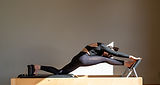
The Hope Star Studios logo artfully places the silhouette of Hope performing a pilates move at the heart of the 'O'. The silhouette represents Hope herself, embodying strength, flexibility and experience. Her pose signifies the empowering journey that clients can expect at Hope Star Studios. By positioning her silhouette in the centre of the 'O,' the logo visually anchors the brand name with elegance and precision. It creates a focal point that embodies the personalised and bespoke nature of the service while reinforcing the philosophy that each client's journey is uniquely theirs. It serves as an invitation for clients to explore their own inner potential and join a supportive, world-class wellness community.
The Hope Star Studios logo places Hope’s silhouette inside the ‘O’, symbolising strength, flexibility, and experience. Her pose anchors the brand with elegance and highlights the personalised journey clients can expect. It is both a visual signature and an invitation to join a supportive wellness community.


BRAND COLOURS BY TRKD|OUT STUDIOS
Next Project
